mandatory assignment – interactive infographics website

Create an Interactive infographics website. This website is presenting a symbol, which is going on a journey through four different style eras from the last 50 years. This object is changing through the different styles, and helps presenting Abstract Expressionism, Swiss, Pop Art, and Psychedelia.
The target audience is High School students, studying Media and Communication, and the site must be designed to meet this group of people.
So here is my report, going through a journey of planning, design, development and through to the finale stage, launching the site.

The object i chose for this assignment was glasses. The journey of my object was from the 1940s, to the 1970s. Going on a journey

learning activity – building a website from start to finish

1. Write a detailed brief for your website.
2. Create a wireframe according to the brief.
3. Draw some sketches to plan your design.
4. Build a working websites according to these specs.

It’s important for me to see that you can follow through on the entire process – from the brief to the completed website. Please explain why you make certain decisions. How do these decisions fit in with the business strategy?

Upload your brief, wireframe, sketches and link to your website to your WordPress blog. There’s quite a lot to do for this assignment, so it’s advisable to keep your website simple

BRIEF
Creative and structureded newly educated graphic designer who works with logo design, web design, motion design, brands etc. Good knowledge from the Adobe programs, Photoshop, Illustrator, InDesign, Dreamveawer, Adobe After Effects etc.

GOALS
The goal with this website is to show my graphic design work to others, by showing my latest work in the Portfolio page and maybe be an inspiration to other designer world wide. The goal is also to show who i am behind my design.

TARGET AUDIENCE
Design companies within advertising, drawing, illustration and future customers.

COMPETITION
Other graphic designers which also offer the same services as i do.

CONTENT
Home, about, portfolio, resume & contact.

PRODUCTS
Logo, photography, html & css.

WIREFRAME

wireframewireframeaboutwireframeportfoliowireframeresumewireframecontact

Link to my website.

learning activity – coming up with a stratergy

I was supposed to post this on saturday, but i have been lying all weekend with a terrible migraine so i`ll post this today.

1.Set up a meeting with a business owner and ask him/her what he/she would want from a website. Also ask him/her what the business strategy is and how the website would fit into it.
2.Then write a detailed document about this.
3. I would like you to use the information from this document and create a website architecture.
Now let’s focus on the web design strategy. Your document should justify all the major decisions you make – from the domain registration, hosting, design and target audience through to what you decide in terms of programming.

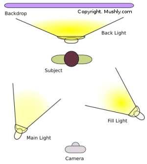
I chose a good friend of mine who is a photographer apprentice, and she also has her own sole proprietorships. She take on both small and bigger jobs, like children photography, confirmations, pregnant photographing, portraits, wedding etc. She has a great experience by photographing, she has studied media & communications on high school, and she has studied photography in a population college here in Norway. Her target group is both women and men in the age of kids to grownup`s.

What my client want from a website is a website with a unique, but simple design which represents her photographs and conveys information on her business in a practical and creative way. My clients business strategy is primarily identify which products and services there is interest and needs for, so i don`t spend unnecessary time, energy and money on something customers don`t have interest for. I will examine what the prices other in the industry have, and set up a price list. To begin with i probably would go for a lower or the same price as my competitors. If i go for a higher price than my competitors my guess is that my clients would chose a competitor, instead of me since my services is fresh on the market and since nobody knows if thats are any better than anyone else have to offers. It can be a good thing to have a website which shows what i as a photographer can and what i have to offer for my clients. I would started campaigns and competitions to attract myself clients in different target groups. Social media has come to be, so marketing through for example Facebook, Instagram etc where people can like, comment & share could be a good idea. Otherwise i think that good service and quality strong products is important to achieve happy clients. If my clients are happy and the business goes well, i most likely have chosen a good business strategy and i have reached my goal by starting my own business.

The strategy with the website is to make a good website with a satisfied design which the products could live up to. The website has to presents the products in a good way so the clients want to use my client over and over again. The website needs to have a good portfolio with different categories, so customers can see what the photographer has to offer in different categories. In addition to a portfolio page, the website also has to have an about site, where information of the photographer can seem exiting, and could stand out. The website also needs a contact page where customers easily can contact and “book” the photographer.

I proposes to either build this website in WordPress, or One.com`s system, Web Editor. If the website is build on one of these to alternatives, the client easily can make changes on the website her self. When she has to chose a domain-name, is proposes that she chose a simple name that is easy to remember, and which is representing here as a photographer, like evelynphotography, evelynwillmannphotography or ewphotography. I think is has to be her name and the word photographer, so people easily understand what kind of website this is.

For the typography and colors in the design at the website i would have use a few, 1, 2 or at the most 3 colors, and 1 or at the most 2 different typographies. And i feel that the colors and the typography in her logo should represent her site as well, so every element in the website is thought through.

evelyn

learning activity – applying basic animation principles

Create a character. This character can be a letter, a person, an animal or any type of illustration, use your imagination. This character will play the main role in your animation. Take this character and draw it in five different exaggerated poses. In each of these poses the character has to express some kind of emotion.

Skjermbilde 2015-02-22 kl. 18.18.02Skjermbilde 2015-02-22 kl. 18.18.15

Yup, i know, i am a terrible drawer.. At least i have started my “winter break” so i will just chill, aand look at the assignment and adobe after effects.

learning activity – focusing on design with a conscience

Analyse his poster for the 2008 U.S. Presidential Election and give your opinion on the use of style and its efficacy. Also critique the use of pastiche and typography.

barack_obama_hope_poster

The style that have been used here reminds me about the plakatstil & art deco stil. The colors are strong and the look of the poster is really thoughtful. The typography is good and it fits the posters style and colors.

The design is good. Each object fits with each other, and it becomes a entirety.

learning activity – research on late modernism

– Research on the Swiss International Style
After you have done research on the style, give a description of your own. How would you define the style? Do a write-up of about 350 words and discuss the characteristics of the style, the typefaces that were prominent and the philosophy behind it.

The international typographic style also know as the Swiss style is a graphic design style which was developed in Switzerland in the 1950`s. The swiss style emphasizes clealiness, readability and objectivity. The indication of the style are asymmertric layouts, use of a grid, sans-serif typefaces and flush left & ragged right text. The swiss style has a preference for photography. Many of the early international styles works featured typograpghy as a primary design element, and it is for this that the swiss style is named.

– Influences on Swiss International Style
Do a write-up of about 350 words on what you think the main influences were on the Swiss International Style. In other words, what motivated designers to create and follow this style? It may be useful to study specific designers, such as Josef Müller-Brockmann and Armin Hofmann, pay attention to what they themselves (or other designers amongst their peers) have said about the philosophy of the style.

Since the swiss style was developed after the war when the economics started to grow again, the main focus was on the product which was going to be promoted. Photography was the most effective way to communicate the product. Josef Muller-Brockmann was a leadning theoretician of the swiss style, and stands for objective and geometric design. He invented a system for graphic design and order and system where two important elements in his design. He favored a clear event where typography and photography where it is a clear prioritization.

– Analysis of the Swiss International Style
Read up on the different schools within the Swiss International Style: The Zurich School of Arts and Krafts and The Basel School of Design and do a write-up of the similarities between them and the differences in their approaches. This write-up should be your own conclusions, based on examples of work and stated facts and should be approximately 350 words long.

Zurich school of arts and krafts in Switzerland was led by the designer Josef Muller-Brockmann. The led of Basel school of design was Armin hoffmann. Both these two schools favored simplicity, readability and objectivity. On these schools the use of sans-serif typography, grid and asymmetric layout developed. The combination of typography and photography was also a link for visual communication.

learning activity – studio lighting.

Question 1.

1. Name three lighting sources and their functions.

KEY LIGHT
Is the first lighting and the most important light that a photographer will use in a lighting setup. The purpose of the key light is to highlight the form and dimension of the subject.

FILL LIGHT
This is the secondary light source that balance remaining to the key light. This light can make the shadows created by the key light softer and lower contrast.

SEPARATION LIGHT
This light is placed behind the object to create depth and separate the object from the background.

2. Name two light modifiers and explain the difference between them.

REFLECTOR
A reflector is used in photography to seperate the light to the model/object. Every reflector is different, so you can use the one that is best for what you are going to take pictures of.

UMBRELLA
A umbrella reflects the light from the strobe light. The white, silver & gold umbrellas give different lights to what you are going to take pictures of.

3. Draw a diagram of and describe the three-point lighting setup.

lighting

Question 2.

1. Draw three studio setups for the following subject matters and list all the equipment that you would use to light your subjects

PORTRAIT

portrait

FASHION
fashion

BEAUTY
beauty
2. In a magazine or on the Internet, find one fashion shot, a beauty shot and a portrait shot and explain how you think the lighting was set up in each shot.

PORTRAIT
sea_by_gretatu600_899
On this photograph i think the photographer may have used a fill light and a main light.

FASHION
fashion-photography
I like this photo alot, and i think the photographer has used both fill light, key light and two soft boxes.

BEAUTY
ksenia1

On this beauty shoot i think the photographer may have used a fill light.

QUESTION 3.

Take some portrait shots and pay specific attention to the lighting you use. I would like to see a shot with soft lighting and one with more dramatic, harder lighting. It would be beneficial to hire studio lighting, but if you can’t, you may use natural light, reflectors and your camera’s flash.

pace and contrast.

This learning activity is about to compare the design of an online magazine, blog or website to that of a printed magazine, book or journal. I am going to tell you what difference i can see between the kinds of design strategies used in the two format. I chose the magazine Costume.

Online.

Skjermbilde 2013-10-23 kl. 10.09.18

In the online version it is so much more that is going on. You have the advertising, the slideshow of pictures and it is difficult to read since it is so much going on at the same time. It can also be hard to find what you are looking for when it is so much text and pictures on the page.

Printed.

IMG_7684

This printed version is so much better to read. You have the overview, and there is not any form of advertising which is good, because then you can read the article, without being distracted in any way. Since the background of the article is white, and the text is black it all seems so much “cleaner” and it gives it a great contrast.

When you read a magazine online, you just scroll down the page and you don`t read everything, but the printed version makes it better to sit and read it. In the online version you have to click on the article you want to read, but in the printed version you can just read, it is better to read and it is no that stressful.