On monday we got a new mandatory assignment witch is combined with the four next learning activities.
Develop a name for a dog food product. Design a logo for this product, using full colour. The logo must contain a main visual and typography. (Use the “People Saving Pets” logo as a guide – this does not mean your design should be the same, it is simply an example.) Follow each of the fundamental steps outlined above, in that sequence and take note of what needs to be handed in as you progress through these steps
1. Exploration
Use sketching techniques to draw thumbnails and hand in your thumbnails as scanned PDFs.
2.Focus
Highlight three of the thumbnail ideas that you consider the best options and state why. Hand in an A4 with visuals of the three chosen thumbnails; include reasons for choosing each of these three options.
3. Construction
Use sketching techniques and redraw ONE of your chosen concepts until you’ve reached a conclusion on a successful logo. Hand in your drawings as scanned PDFs.
4. Testing
Experiment more with your favourite options from Step 3 and ask the opinion of a few people. Hand in examples of the logos shown to people and write their feedback or opinion on each.
5. Refinement
Choose your final design and execute it in Adobe Illustrator, along with the name of the product. Hand in your final logo as an A4 PDF.
I searched alot on the internet to find different brands, logos and different name of dog food products. I wanted my dog food product to get the name “Happy paws” Simply because i think that was a great name for a new dog food product. My target group is people between 20-50 who love dogs, take care of their dogs and spend time with these beautiful pets. I also want the owners of the dogs to be clear of different food who is right for their dog, if he need allergic food, or food with some fat and so on.
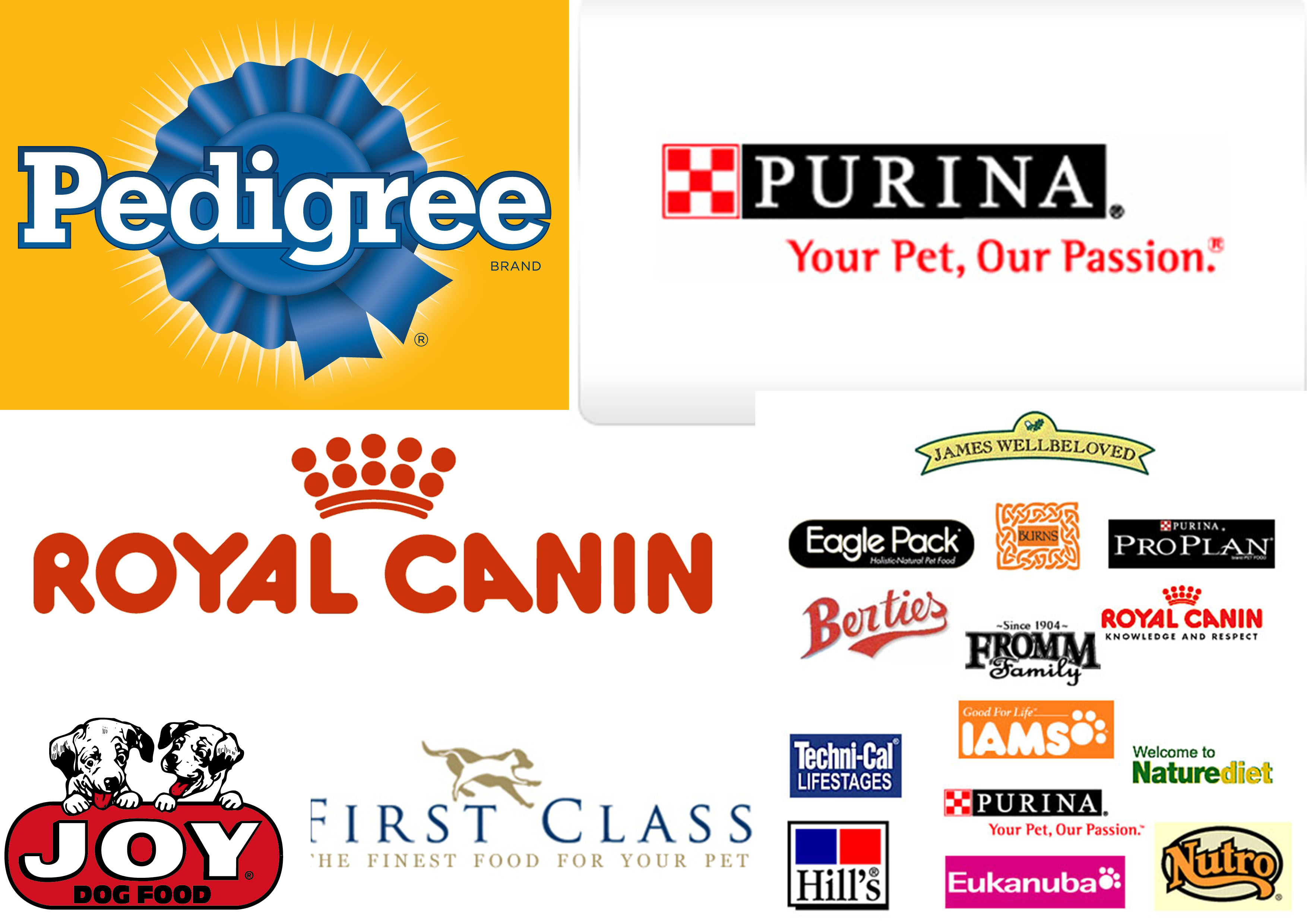
I have made two moodboards. One with dogs food logos, and one visual one some inspiration for my logo.

Here is the colors i used for my brochure.

Here are my sketches, task 1 & 2


Task 3 was to redraw one of my sketch until i have reached a conclusion of a successful logo. I chose to redraw the sketch where the visual paw i is in the word “pawschoice on sheet two.

Task 4 was to get feedback and opinions from a few people. They told me to put the paw inside the text, because it would look more like a logo, and so i did. I think the logo have more potensial now, when the paw is a part of the text in my logo.
And here is my result! Task 5.

